
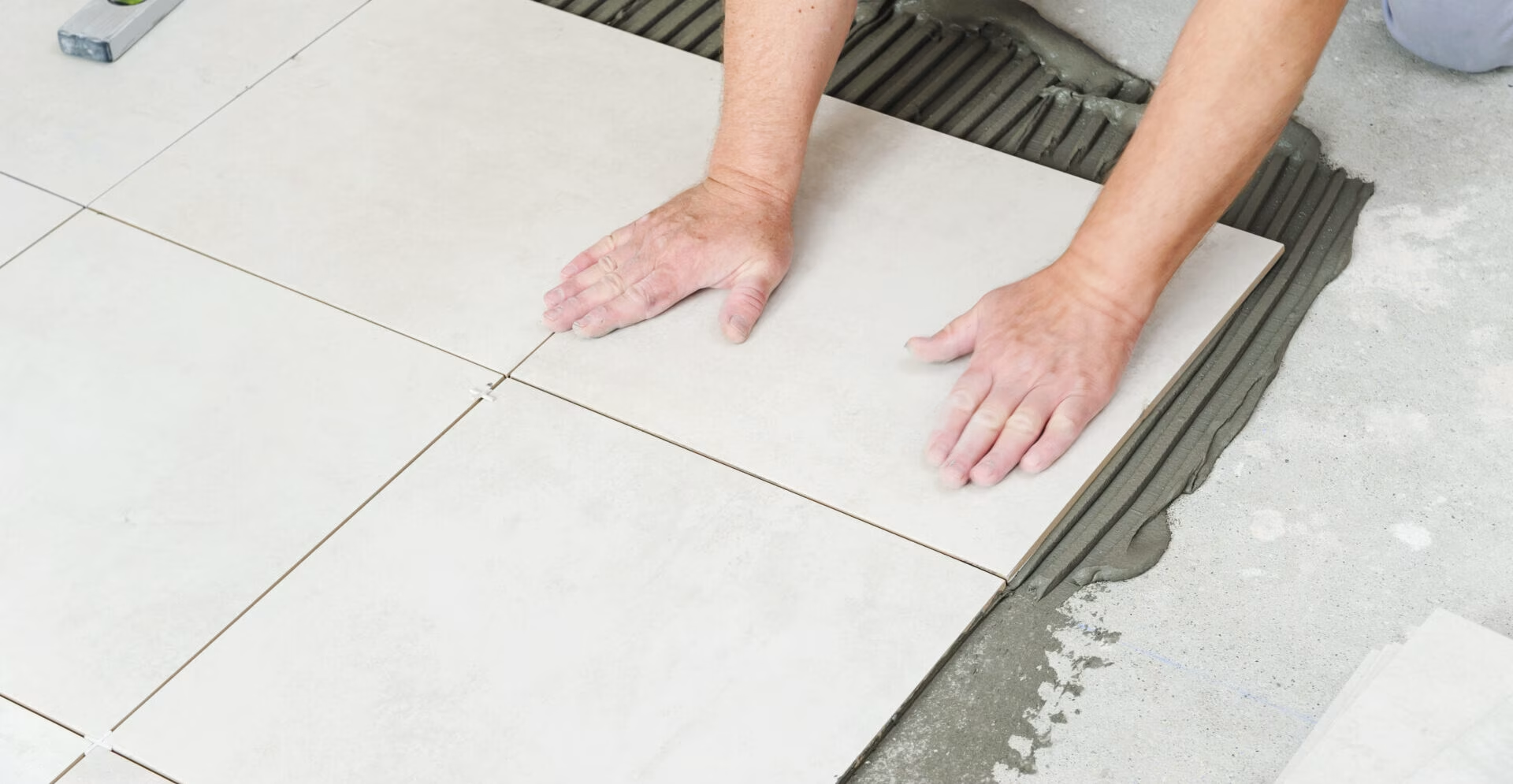
Two kitchens can use the same tile and look noticeably different because of the grout. A close colour match can make the surface feel quieter and more continuous. A contrasting joint can turn each tile into a distinct shape, bringing the pattern forward.
This makes grout colour a design decision worth resolving before installation. Choosing it from a small chart after approving the tile can leave you with a result that feels busier, darker or more defined than expected.
When planning kitchen tile installation in Toronto, review the tile, grout colour and joint width together. They form one finished surface, even though they are selected separately.
Decide What You Want to Notice First
Start with the role you want the tiled surface to play in the kitchen.
Should the backsplash provide a quiet background for the cabinets and countertop? Or should its pattern be a prominent feature?
A grout colour close to the tile generally reduces the visual separation between pieces. A contrasting colour makes the joints more noticeable and can emphasise the arrangement.
For example, a white rectangular tile with a similar white grout may read as a lightly textured surface. The same tile with a dark grey grout creates a more pronounced grid.
Neither approach is automatically better. The useful question is whether you want attention on the tile’s colour and texture, its individual shape or the overall pattern.
Compare Three Approaches
Grout selection is easier when you compare a few deliberate options rather than working through an entire colour chart.
| Approach | Likely visual effect | What to review |
|---|---|---|
| Close colour match | Softer separation between tiles | Whether the undertones work together |
| Moderate contrast | Visible pattern without the strongest outline | How it relates to counters and cabinetry |
| Strong contrast | Clearly defined tile shapes and joints | Whether the full surface feels too busy |
“Matching” does not have to mean an exact colour match. A slightly lighter or darker shade may still create a restrained result.
Likewise, contrast does not always mean black against white. Warm beige beside cream tile or pale grey beside charcoal tile can produce a visible outline without using opposite ends of the colour range.
Look Beyond White, Grey and Beige
Colour names can conceal important differences.
One white may look warm and creamy, while another appears cooler. Grey grout can carry blue, green or brown undertones. Beige may look balanced beside one tile and noticeably yellow beside another.
Place the proposed grout colour beside the actual tile, countertop and cabinet finish.
Pay particular attention when several pale materials meet. A small undertone difference may be more noticeable in a kitchen with white cabinets, a light countertop and a pale backsplash than in a room with stronger colour variation.
If a grout sample looks right beside the tile but wrong beside the countertop, reconsider the combination as a whole. The grout will be seen alongside both materials every day.
Consider the Pattern Before Choosing Contrast
The more complex the layout, the more influence grout can have on its appearance.
With a simple stacked arrangement, contrasting grout brings out the grid. With herringbone, it traces the direction of each piece. With mosaics, it can become a substantial part of the visible surface.
A patterned tile adds another layer. Strong grout contrast may compete with the design printed or formed on the tile.
Ask to see the proposed combination across several pieces in the intended arrangement. One tile beside a grout stick cannot show how repeated joints will affect the full backsplash.
If you want a decorative layout to remain the main feature, contrast may support that goal. If you prefer the arrangement to reveal itself more subtly, a closer colour relationship may work better.
Review Joint Width at the Same Time
Colour and joint width work together.
A wider joint shows more grout. A narrower joint shows less, but its width still needs to suit the selected tile and installation requirements.
Do not choose an unusually narrow joint simply to make a contrasting colour less noticeable. Confirm an appropriate width with the installer, then assess the colour at that width.
This is especially useful with tiles that have irregular edges or visible size variation. Their joints may have a different appearance from the crisp, uniform lines shown in a product photograph.
Ask for the proposed joint width to be included in the layout discussion. It should be understood before the tile is installed.
Check the Tile’s Own Colour Variation
Some tiles have a consistent surface colour. Others vary noticeably from piece to piece.
A grout that closely matches one tile may contrast with another from the same range. With varied stone-look, handmade-look or multicoloured products, the aim may be to find a shade that sits comfortably within the overall palette.
Spread out several representative tiles before comparing grout options. Include lighter and darker pieces rather than selecting only the ones you like most.
For a heavily varied tile, consider whether the grout should blend with the background colour or introduce another distinct line. A quiet grout choice can help avoid adding more visual activity to an already varied surface.
Test the Combination Under Kitchen Lighting
Grout colours should be reviewed where they will be seen.
Daylight, ceiling lights and under-cabinet lighting can make the same combination appear different. Shadows around textured tile edges can also strengthen the appearance of the joints.
For a backsplash, hold the samples vertically rather than judging everything flat on a table. Place them near the countertop and check them with the under-cabinet lights switched on.
For a floor, view the samples from standing height as well as close up.
Take photographs if they help you compare options, but make the final decision using the physical materials. A phone screen should not be the only basis for approving a subtle colour difference.
Use a Grouted Sample for Close Decisions
A colour chart is useful for narrowing the options. A sample made with the selected tile and grout provides a more direct view of the combination.
Where a sample is being prepared, agree on:
- The actual tile product.
- The grout product and colour.
- A representative joint width.
- Enough tile pieces to show the intended effect.
- When the sample will be ready for colour review.
Review the completed sample once it is ready according to the product instructions. Avoid treating freshly applied grout as the final colour reference.
A sample is particularly useful when choosing strong contrast, working with textured edges or trying to coordinate several similar neutral finishes.
It also gives everyone a shared reference. Terms such as “soft grey” or “almost matching” are open to interpretation; an approved physical combination is clearer.

Separate Colour Choice From Grout Product Selection
A preferred colour does not establish which grout product is suitable for the project.
Discuss the product’s intended application, compatibility with the selected tile, installation requirements and care instructions. The installer should confirm the appropriate option rather than selecting solely from the colour range.
Ask whether the tile requires any special preparation or testing before grouting, particularly if you are considering natural stone or an unfamiliar finish.
You should also understand the maintenance requirements of the proposed grout. Do not assume every product needs sealing, or that every product can be cleaned in the same way.
Keep the final product name and colour code with your project records.
Do Not Choose Dark Grout Only to Hide Dirt
Maintenance matters, but “dark grout hides everything” is not a reliable selection rule.
Different colours can make different marks more noticeable. A darker joint may show pale residue, while a light joint may reveal darker staining.
Choose a colour you are happy to see when the surface is clean, then establish an appropriate cleaning routine for the tile and grout products.
For a kitchen floor, compare samples with the room’s likely use in mind. For a backsplash, consider the cooking area and how accessible the surface will be for wiping.
Grout colour can influence appearance between cleaning sessions. It does not remove the need for maintenance.
Confirm Which Joints Will Use a Different Material
Not every visible line in a tiled kitchen is necessarily a grout joint.
Ask the installer to identify locations where a different joint treatment is specified, such as a connection with the countertop or another change in surface.
Review the proposed colour of that material alongside the grout. Products sold under similar colour names may not look identical once installed.
This detail is easy to overlook when approving a colour chart, yet a long line along the countertop can be prominent in the finished kitchen.
Frequently Asked Questions
Should grout be lighter or darker than the tile?
Either can work. A close match usually creates softer separation, while stronger contrast emphasises the tile shapes and layout. Compare the options beside your cabinets and countertop before deciding.
Is a grout colour chart enough to approve the final choice?
A chart helps narrow the selection, but a grouted sample is more useful when the colour relationship is important. Review it with the actual tile, representative joint width and kitchen lighting.
Can I choose the grout colour after the tile has been installed?
It may be possible before grouting begins, but choosing earlier lets you assess the colour alongside the layout and joint width. It also gives time to confirm product availability and review a sample.
Approve the Tile and Grout as One Finish
The tile sample is only part of the finished design. Grout colour and joint width can change how strongly the pattern appears and how the surface relates to the rest of your kitchen.
Ready to develop your kitchen tile plan? Request a quote from GMT Tile & Reno and let us know which tile and grout combinations you are considering.

Adi is the founder and lead professional behind GMT Tile & Reno Inc, bringing over 20 years of hands-on experience in tile installation and renovation. Known for precision, craftsmanship, and attention to detail, he leads projects across Toronto with a strong commitment to quality results and client satisfaction in both residential and commercial spaces.
